Moving to Android (part one): look and layout
For the last few years I've carried my laptop everywhere, just in case something broke and I had to fix it. I wanted a folding phone so I could start leaving the laptop at home and still feel like I could sort out a problem if one came up. I'd also wanted to try Android for a while, partly to get off the cycle of ever more expensive iPhones. The Galaxy Z Fold8 was the first phone I saw in person and loved, so I bought one to replace my iPhone 13 Pro.
The hardware was easy to love. What I didn't love was how unfamiliar everything looked. Years of muscle memory told me where things should be, and One UI kept putting them somewhere else.
Around the same time, Apple released the iPhone Duo, its own folding iPhone. Its home screen was the look I wanted: iOS, laid out for a phone that opens into a small tablet. So instead of getting used to One UI, I set the Fold up to look like the Duo.
This is part one of a series about making that move easier. It covers the overall style and layout, the notification centre, the app switcher, the wallpaper and the icons. None of it is affiliated with Apple or Samsung.
What you need
Everything here relies on Samsung's own tools, so it only works on a Samsung Galaxy phone. Mine is a Galaxy Z Fold8.
- Good Lock, Samsung's customisation app, from the Galaxy Store. It's a hub for separate modules, and this post uses three of them:
- Theme Park, for the icons.
- QuickStar, for the look of the quick settings panel.
- Home Up, for the app switcher.
- An iOS-style icon pack that Theme Park can import. Mine is Fold Icons, which I made myself and haven't released.
- One UI's split panels, so notifications and quick settings open from different sides of the screen.
- Widgets: Samsung Weather, and a photo widget for the tall panel on the inner screen.
- A wallpaper. I used a desert one to match the Duo.
The Duo as a reference
I started from two screenshots of the Duo's home screen, one folded and one open, and treated them as the spec.
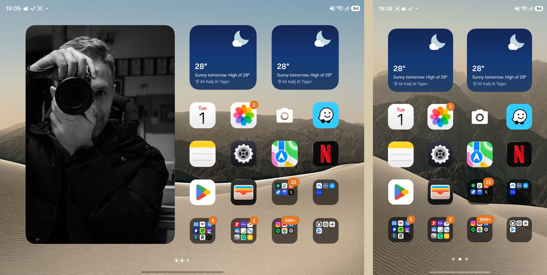
On the cover screen, the Duo has two square widgets across the top, an unlabelled 4 × 4 grid of apps, a dock running down the right-hand side with four apps in it, page dots, and a round search button in the corner.
Unfolded, the right-hand side keeps that same page. The left-hand side gets a tall panel for a photo or a widget. Opening the phone adds space beside your apps without moving any of them.
That's the part I like most. Folding or unfolding doesn't cost you your place. You stay on the same page with the same icons in the same spots, and you only gain or lose the panel on the left.
The home screen
My first attempt was a home-screen app of my own, which drew the Duo layout exactly. It worked, but in the end I went back to Samsung's launcher, One UI Home, and rebuilt the layout there.
One UI Home gets surprisingly close. The layout is mostly widgets and careful placement:
- The left-hand panel is a photo widget, stretched to fill the left half of the inner screen. It only exists unfolded, like the Duo's.
- Two widgets across the top, where the Duo has weather and a map. Both of mine are Samsung Weather for now.
- A 4 × 4 grid below them, with single apps in the first rows and folders filling the rest, all using the icon pack described below.
The cover screen and the right half of the inner screen show the same page, so folding the phone changes nothing except the photo.
It isn't an exact copy. The folders are One UI's, not Apple's, and there's no round search button. The biggest difference is the dock. The Duo keeps four apps in a glass dock running down the right-hand side. One UI Home only puts its dock along the bottom, and I didn't find an easy way to stand it on its side. I'm not a fan of the side dock anyway. It takes a column of space from the grid, and on a screen this size I'd rather have four more apps. So I left it out, and the apps that would have gone in it sit on the grid with everything else.
I used real widgets rather than pictures of Apple's. They don't match Apple's design exactly, because each widget draws itself, but a home screen that shows the wrong weather is worse than one that looks slightly different.
The notification centre
On an iPhone, swiping down from the top left opens Notification Centre, and swiping down from the top right opens Control Centre. One UI can do the same. With its split panels turned on, a swipe down on the left side of the screen shows notifications and a swipe down on the right shows the quick settings. Once I'd turned that on, my thumb stopped landing in the wrong place.
The quick settings panel was the bigger job. By default it's a grid of identical tiles. I wanted Control Centre: a floating card over the home screen, with big round toggles, grouped controls, a media player and tall sliders.
Two tools got it there:
- The quick panel editor, which is the pencil button at the top of the panel. It decides which tiles appear, how big each one is and where it goes.
- QuickStar, a module in Samsung's Good Lock app. It changes how the panel itself looks, beyond what the editor allows.
I laid the tiles out in the same groups as Control Centre. Wi-Fi and Bluetooth sit at the top left as large round buttons. Rotation lock, flight mode, the torch and mobile data share one rounded block, like iOS's connectivity block. The media player sits to the right, with brightness and volume below it as tall sliders. Samsung's Modes takes the place of Focus, and Smart View takes the place of Screen Mirroring.
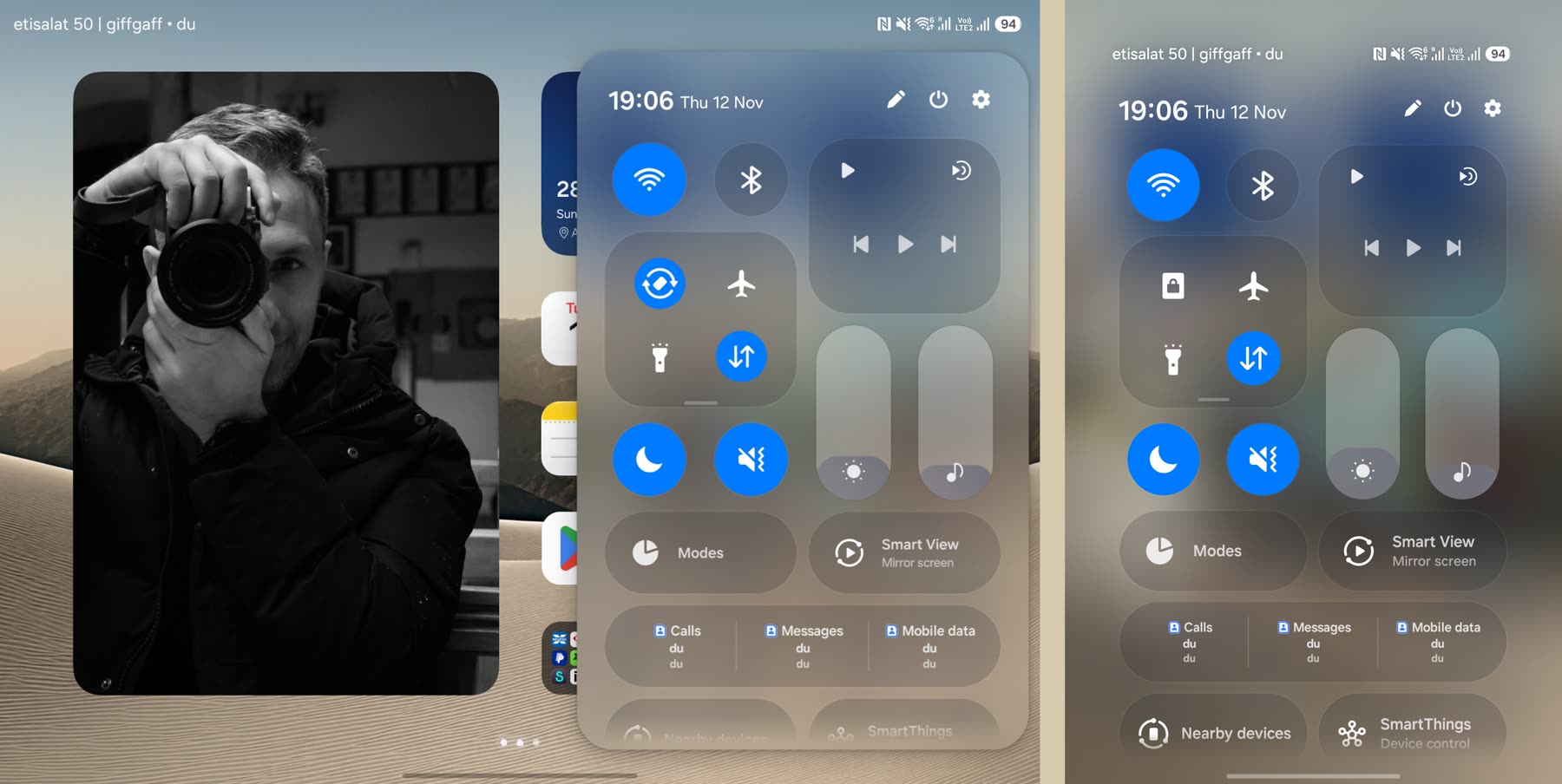
Unfolded, the panel floats over the right half of the screen like Control Centre on an iPad. On the cover screen it fills the screen, like it does on an iPhone.
Some things don't map across. The SIM tiles have no iOS equivalent, and the panel is still Samsung's underneath, so a few labels and icons are One UI's own.
The app switcher
The iOS app switcher shows your apps as large cards in a row, with each app's icon and name above its card. You swipe sideways to move between apps and swipe a card up to close it.
One UI's own recent apps screen already works the same way: swipe up from the bottom and hold, then swipe a card up to close it. The difference was in how it looks. Home Up, another Good Lock module, has a task changer section that changes the layout of the recent apps screen. I set it to show cards in a row, with the app's icon and name above each card.
The active apps pill and the Close all button are One UI's. iOS has neither, but they don't get in the way, so I left them.
The wallpaper
The wallpaper is a desert landscape at 6016 × 3900, a close match for the one in the Duo screenshots. It's big enough to cover the unfolded screen without stretching, and the same image sits behind both screens, so the phone looks the same folded or open. You can see it behind the home screen at the top of this post.
The icons
Icons were the biggest job. A layout with Android icons in it still looks like Android. With iOS icons, it looks like an iPhone.
Samsung's Good Lock app has a module called Theme Park that can import an Android icon pack and apply it everywhere: the home screen, Settings, the share sheet and notifications. So the icons became their own project, Fold Icons, an icon pack built for Theme Park.
For each app on the phone, I found its App Store listing using Apple's search API and checked by hand that it was the same app from the same developer. Then I downloaded the original artwork. Google's own apps map to Apple's equivalents, so Google Calendar gets the Calendar icon, Google Photos gets Photos, Google Maps gets Maps and Gmail gets Mail.
The shape took a few attempts:
- Square artwork. Theme Park didn't round the corners, so every icon was a hard square.
- Android's adaptive icons. Samsung masked them to its own squircle, which looked close but more like Android than iOS.
- A fixed rounded square. I picked the Play Store icon as the shape I wanted, measured its corners at 25% of the icon's width, and baked that shape into every icon. Only the edge pixels change. Every solid pixel is checked against the original artwork and stays identical.
Of the 119 apps on my phone, 99 now have an iOS icon, using 97 different images. The other 20 are still unresolved. They include Settings, the App Store icon for the Play Store and Galaxy Store, and a few Android-only customisation apps. Those keep their own icons, cut to the same rounded shape. That's why the gear on my home screen is Samsung's Settings icon, not Apple's.
The Calendar and Clock icons are static, because an icon pack can only supply pictures. The Calendar icon always shows the same date and the Clock icon always shows the same time.
Where it's got to
None of this makes the Fold an iPhone, and that was never the aim. The apps still look like Android apps, and Samsung's animations are still Samsung's. But the first things I see and touch every day now are where my thumb expects them. The home screen looks like the Duo, the notifications and controls come down from the side I'm used to, and the icons are the ones I've looked at for years. That was enough to stop the Fold feeling like someone else's phone.
Next
Part two covers the animation when the phone folds and unfolds, and part three covers the keyboard.